

Coffee Branding Project
Created a brand concept and identity for a coffee brand that focuses on nutritious and essential ingredients. Researched and marketed towards Generation Z.


For this project, part of ARTD 333 at UIUC, the objective was to create a brand based around a beverage targeted at a specific generation. The project required creating a logo for your brand, as well as a print ad for the product. This conceptual project helped us to brainstorm a need, create a product, and strategize and do the research towards designing for a brand.
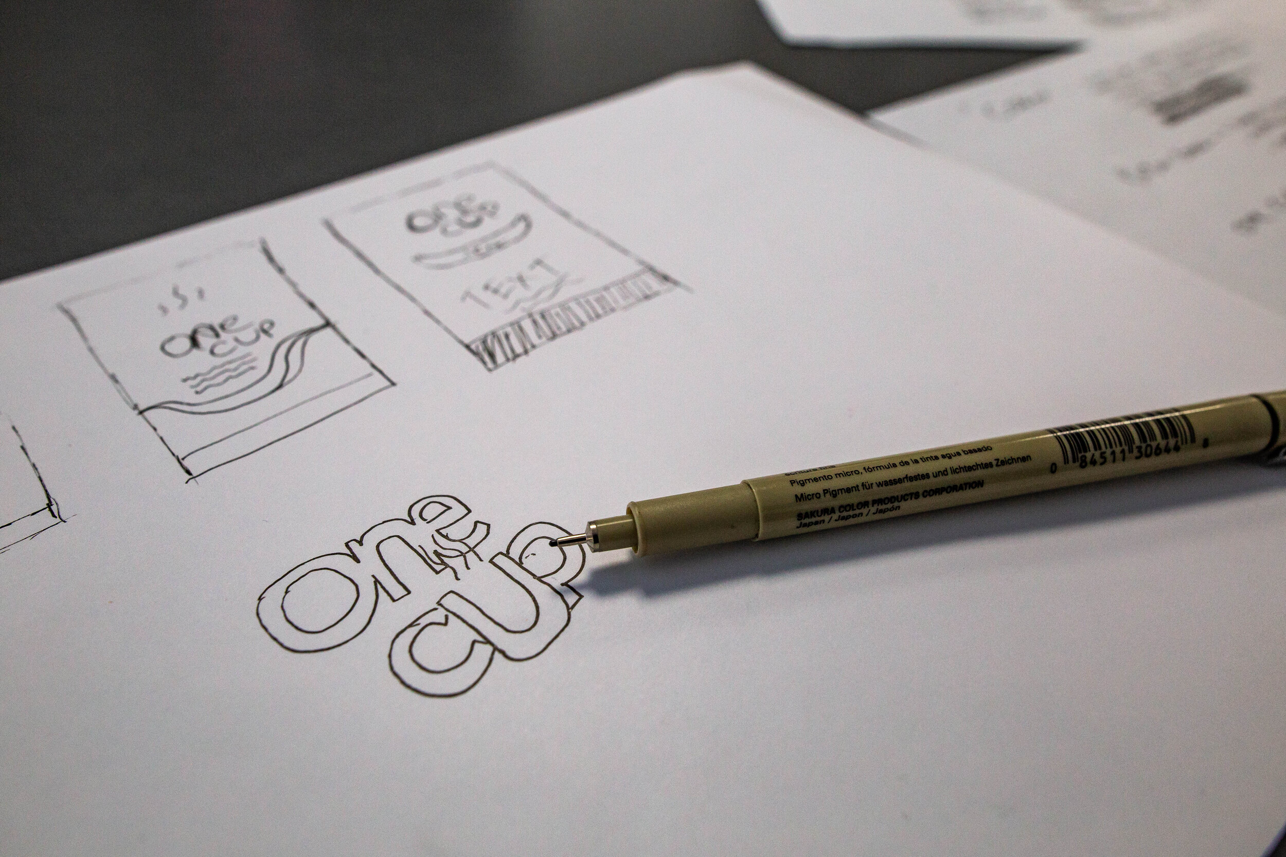
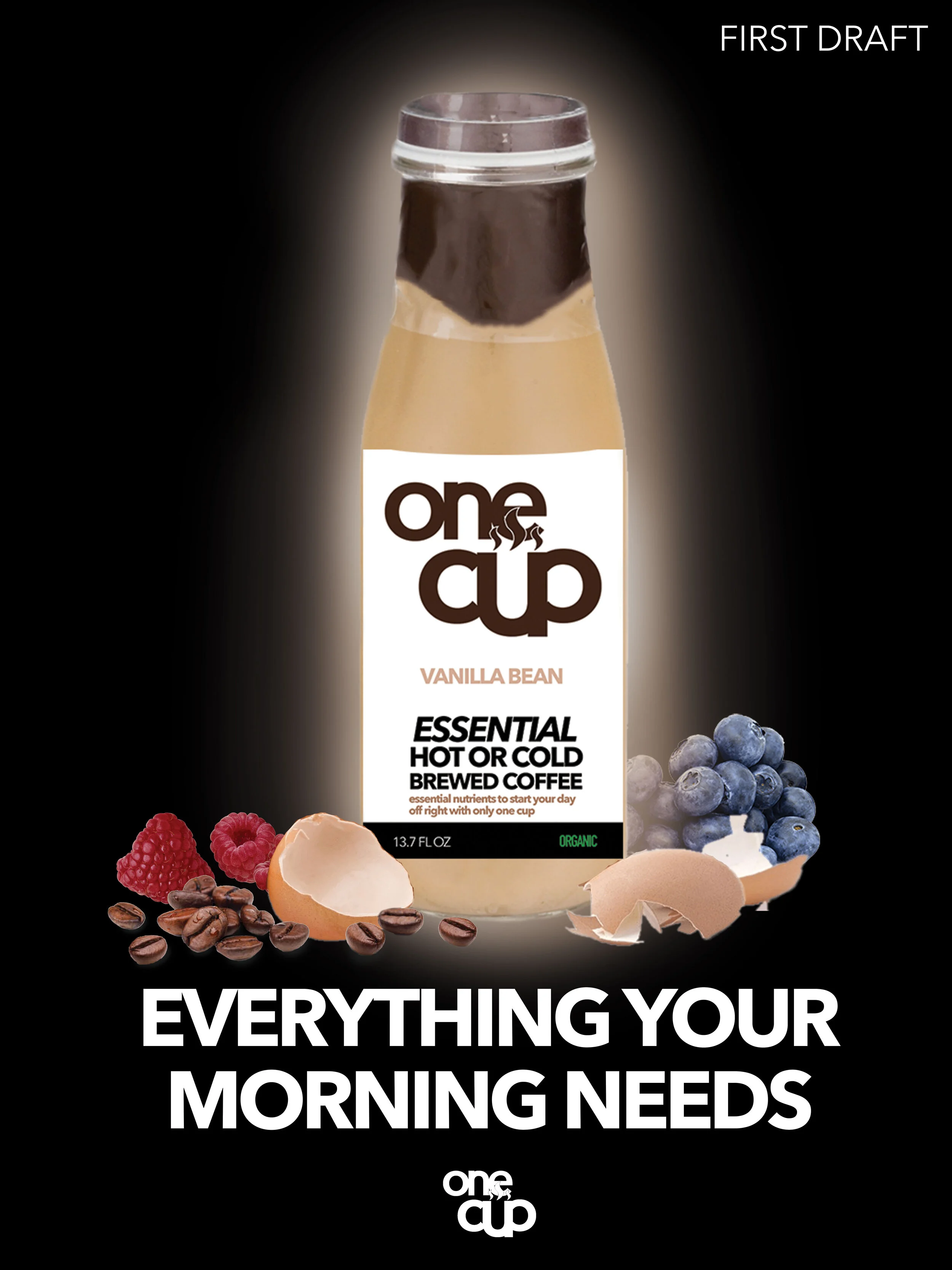
I selected Generation Z, and a coffee beverage, as research has shown coffee is perhaps the most frequently consumed beverage by this generation. Research also shows that Gen Z are more conscious of their health and what they consume than previous generations. I wanted to create a beverage brand that your body and nutrition can trust by always using healthy and essential ingredients, tastes great while still benefitting your body, and that you only need one cup of. Traditionally, coffee drinkers tend to drink more than one cup of coffee daily, some more than others. I named my brand “One Cup”, because the goal is for it to be the only cup you need in a day. It contains all the energy, nutrients, and flavor you need.
One Cup was the narrowed down idea from three potential brand names: Coffea, Brew Good, and One Cup. Each brand was based around a similar message, but each differed slightly. Coffea is named after the “Coffea” plant family, the family that coffee is part of. This name represented that it was not only a family-based company, but it was also very natural and that each drink took as few steps from the plant itself as possible. Brew Good, which sounds like “Do Good”, was a brand all about doing good to your body and the world, and was focused both on nutrition and values. After group critiques, I narrowed the concept to One Cup, as I felt it most closely related to the values of Gen Z, and myself, who are very focused on efficiency.
The logo includes the imagery of a warm coffee cup, which is self-explanatory. I designed the logo and bottle to be very simple, transparent, and straightforward - values that are important with this brand. I want a bottle that is recognizable enough, but also basic to relay the message that the ingredients are as minimal as possible, as well as only the essentials are included. The print ad follows those same values, and includes images of breakfast foods that share many of the same nutrients as the drink - protein, vitamins, minerals, energy, and more.